Tuesday, May 30, 2006

Force of totality revisited

Have previously mentioned Poes force of totality but I found this extract of the article particually interesting:


Here then the poem may be said to have had its beginning- at the end where all works of art should begin- for it was here at this point of my preconsiderations that I first put pen to paper in the composition of the stanza:

"Prophet!" said I, "thing of evil- prophet still, if bird or devil! By that Heaven that bends above us- by that God we both adore- Tell this soul with sorrow laden if, within the distant Aidenn, It shall clasp a sainted maiden whom the angels name Lenore- Clasp a rare and radiant maiden whom the angels name Lenore." Quoth the Raven, "Nevermore."
I composed this stanza, at this point, first that, by establishing the climax, I might the better vary and graduate, as regards seriousness and importance, the preceding queries of the lover, and secondly, that I might definitely settle the rhythm, the metre, and the length and general arrangement of the stanza, as well as graduate the stanzas which were to precede, so that none of them might surpass this in rhythmical effect. Had I been able in the subsequent composition to construct more vigorous stanzas I should without scruple have purposely enfeebled them so as not to interfere with the climacteric effect.

Sunday, May 28, 2006

RESEARCH MODULE: plans for the future

Where will I take this research and my plans for the future

I am not completely sure where I will go in the future. I'm still interested in interactive narratives- mainly because I see that anything, in anything I mean websites, online portfolios, etc would benefit from a bit of narrative. Why should a website be so informative? Websites are generally there to sell things, whether that be a person, a product, a book, a CD, a company etc ( obviously there are some exceptions online banking being one) advertisements on the television usually have a plot, a short story, a narrative flow why should websites be any different?

Over the summer I plan to completely finish my interactive fairytale and try and get it published on the web, as well as creating a new online portfolio that has a narrative. A narrative about me. You will go on a journey- see various pieces of work along the way and navigate yourself around my working practice. I want to make my portfolio an experience, you might miss some of my work on a first visit but it will be there for you later, should you come back. I'm going to go back and look at Scott Mclouds ideas on interface design.

My final project next year will again be a interactive narrative using mobile devices and GPS. I also want to include XML databases mainly so I can learn how to integrate this into Flash. This project has been a tester, its made me see what I need to concentrate on, as well as testing them as I go through, something I lacked during the last few months. I also want to include speech- I spend a lot of time listening to audio tapes and podcasts something which I love to do. Have been thinking of making an audio story combining interactivity, image, animation and text. You can spend your time sat on the bus listening and watching a story on your phone. Maybe this is only something I am interested in but I think it has scope. As I have previously mentioned I would love to transcribe a 17th century authors work Madelaine DeScubareys work- her novels and salon plays are far to long for anyone to read and as I have already mentioned they are perfect for the web. I don't think this is plausible for a eight month project its simply too large maybe for a PHD in later life! I do plan to go to Oxfords Bodlian Library and see some of her work in the flesh. I would like to use a famous authors work for this type of project, Terry Prachatt has a lot of audio material, and as fantasy is my preferred choice of genre he is perfect, maybe I can get him to write me an interactive story!!!! That is where I have got for next year we will have to see..........

Brain ticking over and Akscyn's law.....

Have been working hard the last few days and it would appear that however well prepared you are, something always comes alongs and bites you in the back or your foot or your armpit- somewhere unexpected.

Hypertext systems should take about 1/4 second to move from one place to another. If the delay is longer, people may be distracted; if the delay is much longer, people will stop using the system. If the delay is much shorter, people may not realize that the display has changed
As you can see there is a fine line- a very fine line..............................

DESIGN
:Back to the design a few more problems have come along. It all takes far to long to load. At this late stage there is very little I can do, however this is something which I have to address on my next project. Another problem which has presented itself- which I was aware of but have been ignoring is that there is simply too much text on each page. If we go back and look at my navigation structure you can vagly see that there are 6 sections to each narrative strand- anymore and the text doesn't corralate. This is fine for some of the strands but others have got two pages worth of text that all have to fit on a page. As I have mentioned was going to have text coming up as the reader reads but I didn't really want to have to include this. I can read much quicker then these techniques ever cater for and on the other side of the coin some people might not be even to read a really slow driven one. I came a cross a wonderful website for which I can't find now in which it went completly on how you clicked ie sometimes people are quite clicking mad and click adhock, other people are more restrained. Sorry that goes off the point... The point is maybe you could click on the text to get to the next part of text?????????? This is making it more complicated though for the reader to get there heads around??? Would you need to be able to navigate back on yourself? I didn't want this to happen.... Might have to do the text appearing thing damn really didn't want to do that..... more later on this subject when its done.

Thursday, May 25, 2006

Two More Characters

Wise Man
The Great Lord

Tuesday, May 23, 2006


Can't find the illustrators name, I found them in an old book thats gone slightly moldy but thought they were beautiful. Such definition of line and style.

Don't know who there by

Monday, May 22, 2006

Saturday, May 20, 2006

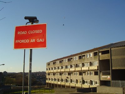
Signs

Typography


Tuesday, May 16, 2006

Monday, May 15, 2006

For the Illustrations:

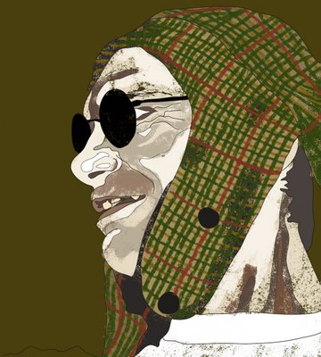
(!) Character Assassinations (!)


Prince Charming:

By anyone’s standards a rather despicable character. Bigamist, Rapist and as the name overtly suggests rather a charmer. I want to depict a rather slimy, man about town, larger lout.


Queen Mother:

I’ve gone for an older woman, mainly due to her taking so long to get pregnant as well as using spells to conceive. Rather drab, grey spiteful women who lacks life and vitality. Main interest is reading Mills and Boom- plans to write one.

King/ Lord:

Again I’ve opted for an older man. I’m thinking much more approachable in mannerisms, loud and pompous with an almost manic, drunken smiling expression. I think he’s verging on alcoholic and narcotic tendencies, as well as having a Freudian view of his daughter.


Sleeping Beauty + Thalia:

A bit of a slut even aged 13, virginity still in tact doubtful. Brassy, loud, spoilt and beautiful in a cheap kind of way, lots of red lipstick. Sexual to the extreme, manipulator and strangely large thighs….


Evil Fairy:

An ancient, arthritic, hacking hag could be three hundred or nine hundred. A 50 a day habit and skin to match. Preferred drink is Gin. Good sense of humour. On benefits, makes a bit of money on the side organizing Frog racing.

Good fairy:

Very slight, elfish, rather plain- nothing to write home about. Middle to late twenties, a terrible suck up with an irritating high pitched soprano voice. She blends into the background and has terrible clothes sense.

Children/ Sun and Moon:

Over-weight children, rather charming and boisterous.


Evil Wife/ Step-mother:

Evil which is what one imagines! Thin lipped, common in appearance- lots of nylon, smokes thin cigars and addicted to valium.
Ticking over

As you can see I’ve rather neglected this blog the last few weeks. Have been concentrating on sketches and the final images although the time is now to sit back and reflect on what is working and what isn’t….

First off notes on a discussion recently had: DESIGN: I feel I’ve rather neglected this part of the project the biggest issue at this point of the course is narrative. How to successfully create an interactive, immersive and satisfying narrative that…In simple terms “Works”. Although I’m pleased with the images that I’ve already created this is not a graphic novel, comic, book this is supposed to be a different experience combining movement- organic movement ( which was what I originally wanted) progression of design and simple graphical animation. I sometimes feel that I look at this project in a traditional print way I need to find new ways to apply traditional strategies of appreciation. Form, Balance, colour, light, surface, space, iconography, representation these and other components are our customary understanding of art and design. I need to think of these and other elements to create a successful digital piece of design. Not sure if that makes sense but it does in my head. I can see what I want but how to accomplish this is proving most difficult. As was pointed out this is a prototype and all these issues do not have to be resolved right now. I think what I’m finding most difficult is working on the illustrations and then putting it all together with the moving text, various pages, the “organic” navigation system, the zoom and drag function and now I’m writing this the actually design in flash. One such question is when you zoom into the page and then drag yourself around does the navigation system disappear so the user has to zoom out to be able to progress to the next section of narrative? Will this effect immersion? Will people understand this? Should I just not bother with the zoom and drag? (While were on this its very difficult designing in Photoshop and thinking of the grander scheme while doing it. Very difficult indeed. I have been doing tests with the zooming- to which point does the illustration look crap- and therefore how big does the hidden images have to be? (Again I’m not happy with my results) All of these questions should have already been resolved however they haven’t. I’ve reached a point where I don’t know what to do. I’ve decided against drawing the images in flash mainly because I know I can do this- but it takes time, too much time as well as limiting what the piece can look like. For my final project I will have to come back to this issue.

I have come to terms with this project not being that aesthetically pleasing- something which grates to someone who’s main concern in anything and everything (rather shamefully) is the design. I’ve also come to the conclusion that I am not going to be able to complete all strands of the narrative. I’ve chosen two and specifically four illustrations that will use movement and action script. As long as I can give a basic idea of what I want to achieve I feel this is plausible.


Navigation: A stroke of genius came my way one evening whilst hanging up a picture: A gallery. The navigation is a gallery- multiple sized picture frames with sections of the illustration that comes with its specific segment of narrative. As I’ve already mentioned and illustrated the navigation is on a grid like structure you as the participant goes from left to right- the normal order of westerners reading. However I wanted to jazz this up a bit- going back to my first project I thought of mirrors and then came up with the gallery idea. The reason this is good is that I want to the navigation to move and change depending on what page you are on. I wanted the navigation to blend in with the design and look like it was meant to be there, not just plonked to the side or bottom of the page. It is in fact an integral part of the design and I wanted to illustrate this. This gallery will change shape and size depending on which page you are at. The image or frame that you choose will “grow” and take up much of the page, the remainder space will have the rest of the navigation, other illsutations and some of the text. This does present problems though- as the frames will be all different sizes and shapes from experimentation it’s sometimes difficult to see which the next frame is, that you’re supposed to look at. Have thought about blending out the images that you can’t look at, but this feels like too many constraints for the viewer. Although I am in charge of the narrative, I’m in control, through constraints I’ve manage to make this text resemble something of a narrative, but I didn’t want to have to spell it out quite so blatantly to the viewer. I think at this late stage I’ve just got to decide something and go with it; however this will be my first question asked when I start my final project. Even as I write this is a few more problems has presented themselves as well as a few answered. My original idea was to have the navigation system the design of the page but I seemed to have lost this idea through the process and it has answered a few of the problems stated here. I don’t need to design the illustrations with the text. This is separate- in a frame…. The text will mostly be outside of the frame. More on this later I will go and see if this helps!

Thursday, May 04, 2006

Review

“Hosts” is an exciting project shown at the prestigious and famous Bath Abbey, and has been inspired by the ladder motif on the west front of the abbey. Martin Rieser, professor of Digital Arts at Bath Spa University, has hung five giant screens at strategic points of the abbey space. Wearing special ultrasound-emitting badges and wireless earphones the participants in Hosts trigger the presence of a variety of characters. These "hosts" are a wide range of ages, gender, social types and races, and always appear singly to the participant.


The general premise is a 3D audio landscape of footsteps, tonal voices and breathing sounds which accompany the visitor between the screens and form a tangible changing audio landscape. If a visitor stands for more than a few seconds in front of a particular screen, the figure will turn in the direction of the viewer and return the visitors stare. The video’s character look’s the visitor up and down, or turns away in distraction. The characters then speak a series of poetic phrases, also seen as animated text on the screen. A character follows you around so to speak, you move the character moves which give the viewer a real feeling of authorship- or a feeling of being involved in what is happening.


All of this can be as interesting for a spectator who has not purchased the electrical devices as those who has; although you will not have the ability to hear the speech just watching other people, watching the characters on the screen and the movement that is generated, can be just as interesting and strangly hypnotic. People wondering around a Cathdral with there eyes pointing upwards to the heavens is surely something that can be experianced everyday!

On the last screen of the installation, which is always there, is pictured two vertical ladders, placed on opposite sides of the space, and disappearing beyond the screen edges. On one ladder the characters are continuously climbing upwards and vanishing. On the second ladder they are climbing downwards from the top of the frame and walking off screen. Personally this was the most interesting part. Although the technologies used for this section of the space, are at its most basic, simple video and audio, on such a scale and such a setting, it is the most poignant and resonant part of the whole installation.

Sounds impressive? It certainly looks impressive; the large screens are overwhelming, towering up between the arches to monstrous proportions. The audio sounds coming from the headphones are loud, and uncompromising. This piece screams look at me, listen to me, and for that reason alone deserves a seeing.

I did find the content of the piece rather grating after a while, and as with all new media pieces there is a certain element of using technology for the sake of it. Should technology dictate what the artworks looks like? Or should the artwork dictate which technologies should be applied? Rather like the Chicken and the egg, there is always this question. I suspect that the technologies here dictated what the artwork looked like.

Although not completely successful in its attempt; it is an enjoyable, interesting experience. This exhibition shows us what to expect in the future, if you think of it, if you will as a practice, give this genre another ten years and the results will be spectacular. An engaging, multi sensory experience which defies your imagination, and expectations.